Comparison of the Top Professional Watercolors
An Iconic Color, A Global Test
After years of painting in watercolor and learning as a self-taught artist—through books, videos, and endless practice—I’ve come to realize how few painters, even experienced ones, really understand the unique characteristics of each pigment. That’s especially true when it comes to how different brands handle the same color.
That’s why I’ve launched my new YouTube channel: Juan Anelo Watercolor.
My goal is to share in-depth, high-quality content in Spanish, aimed at artists who want to truly understand their materials. And I couldn’t think of a better topic to start this journey than… Yellow Ochre.
Why Yellow Ochre?
Yellow Ochre has been with us since the dawn of human creativity—used in prehistoric cave paintings and throughout the history of Western art. Personally, it’s one of the core colors in my palette. I use it constantly, both on its own and in mixes.
It’s also a deeply personal color for me. My father, an oil painter who worked with only five or six pigments, always had Yellow Ochre in his limited palette. That memory stayed with me, and so this color felt like the natural starting point for this new phase.
18 Brands, One Color
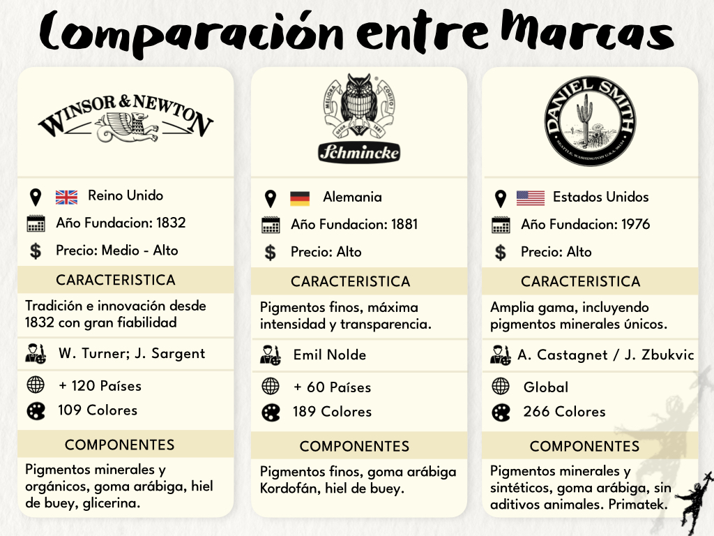
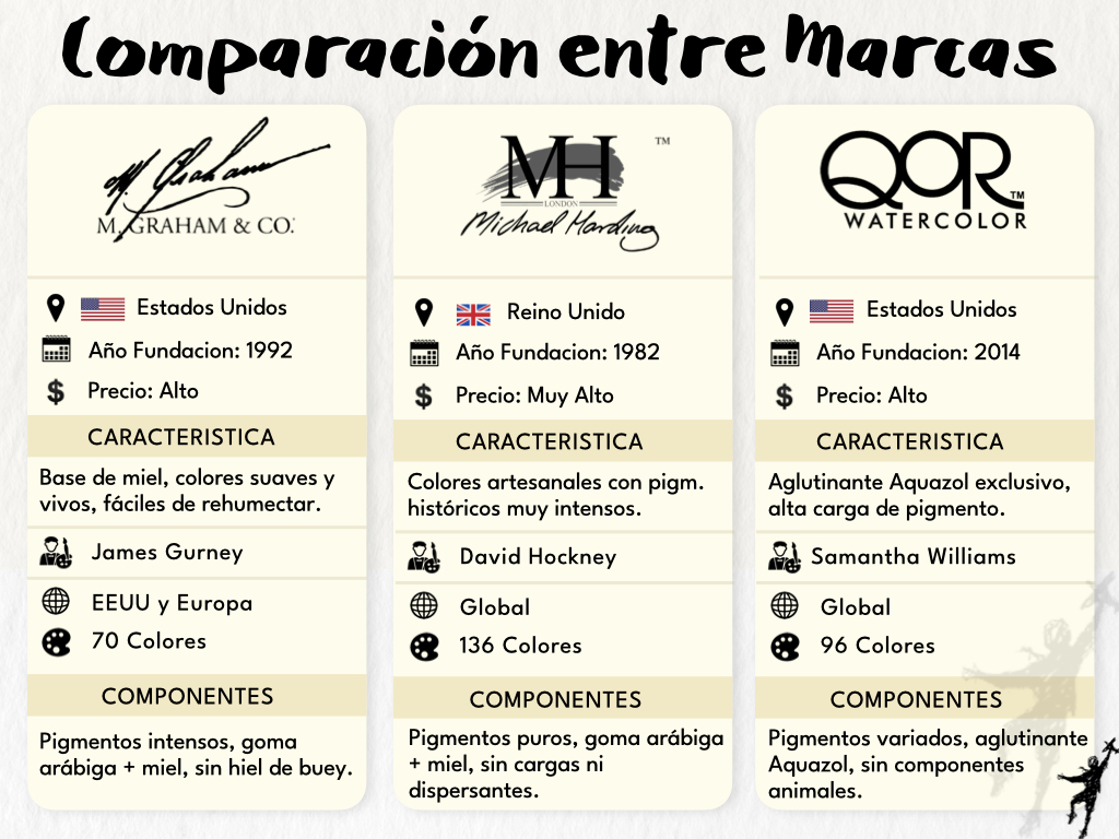
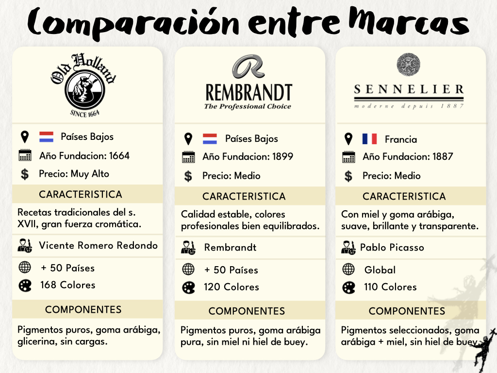
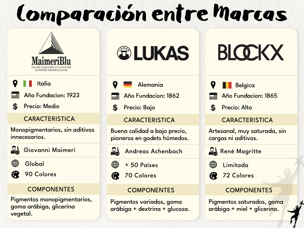
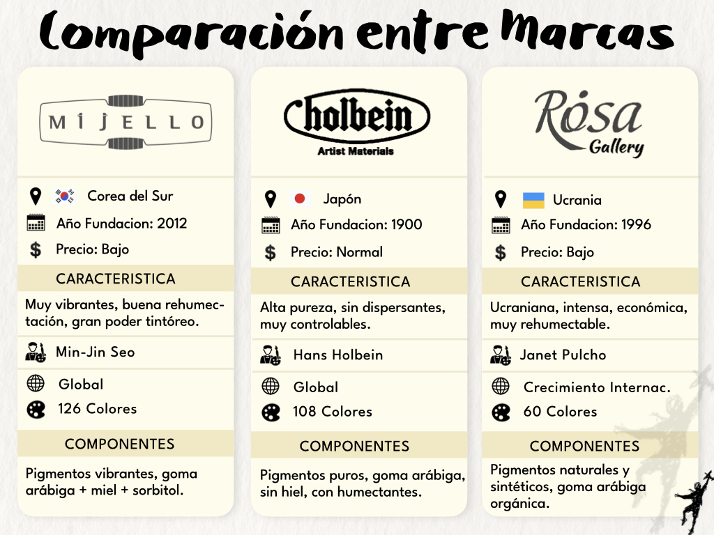
For this video, I selected 18 of the most renowned professional watercolor brands, from historic to contemporary:
Winsor & Newton · Schmincke Horadam · Daniel Smith · M. Graham · Michael Harding · QoR · Old Holland · Rembrandt · Sennelier · MaimeriBlu · Lukas · Blockx · Mijello Mission Gold · Holbein · Rosa Gallery · White Nights · Roman Szmal · Shinhan
It’s a true world tour of watercolor manufacturing—and the differences are fascinating.
What You’ll Find in the Video
To make the comparisons easier and more visual, I created custom “pigment cards” for each brand. These show:
- Tonality (hue and temperature)
- Transparency
- Luminosity (chroma or saturation)
- Lightfastness
- Granulation
- Staining (paper adherence)
This system allows you to compare each version of Yellow Ochre at a glance, by both technical specs and visual impression.
Materials and Technical Details
🎨 Medium: 18 professional brands of watercolor
📄 Paper: Arches, 100% cotton, fine-grain
🖌️ Brush: Escoda Reserva (Kolinsky sable)
🎥 Video Format: HD, natural daylight + White light LED, real-time swatches and commentary
📅 Date: March 2025
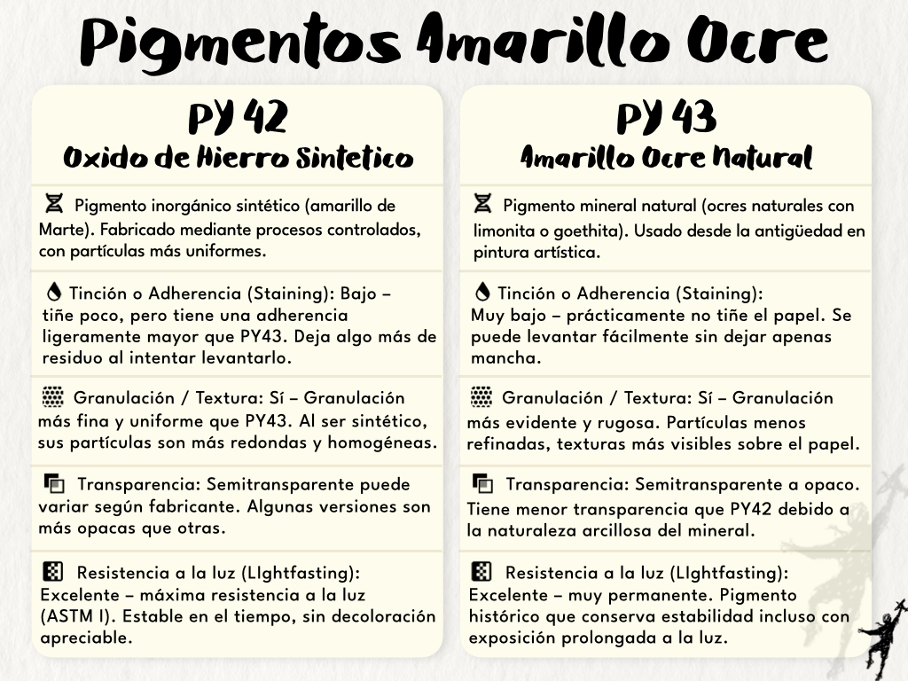
🟡 Focus: Yellow Ochre (PY42, PY43)
Main Findings and Personal Favorites
There are clear and notable differences between brands, even for the same pigment name:
- Cooler Yellow Ochres: M. Graham, White Nights, Mijello
- Balanced Midtones: Schmincke Horadam, Blockx
- Warmer, Earthy Tones: QoR, Daniel Smith
📌 My personal top picks:
- M. Graham – for its smooth texture, high transparency, and cooler tone
- Schmincke Horadam and Blockx – balanced, versatile ochres
- QoR – for a warm, reddish tone with excellent wet-on-wet performance
Final Thoughts
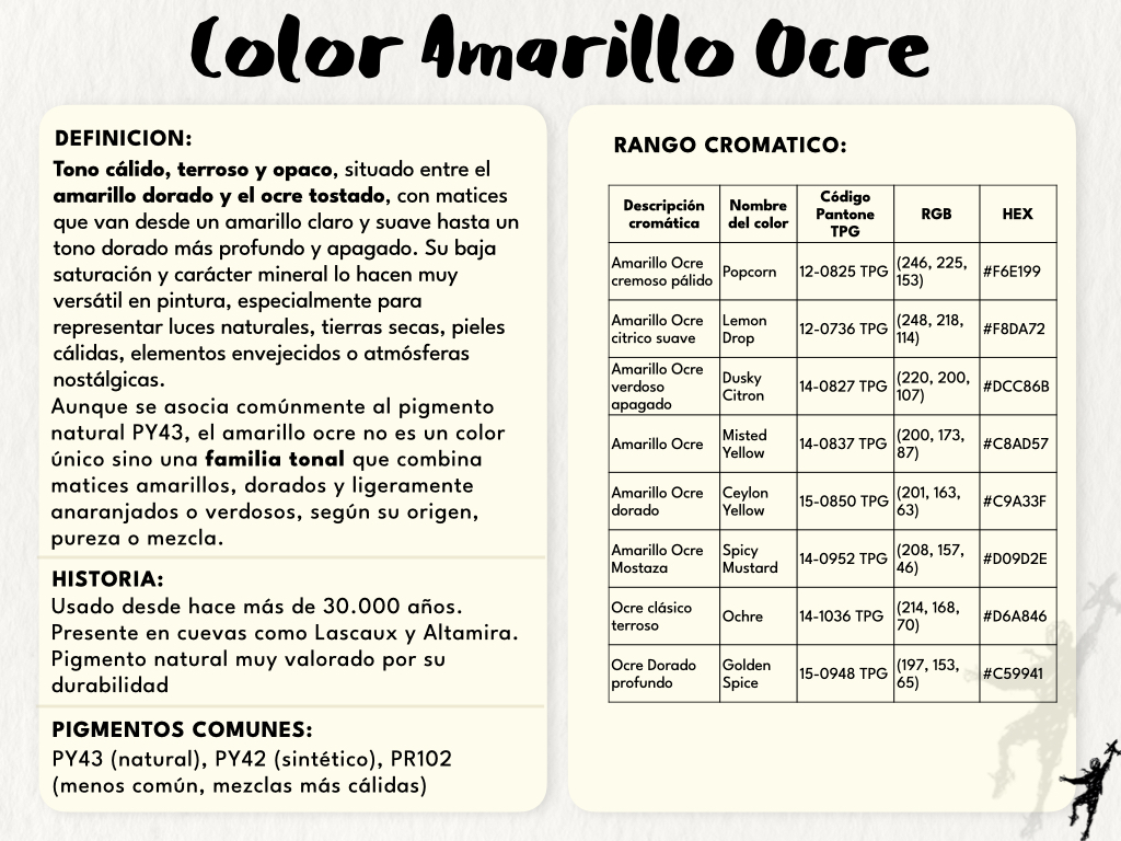
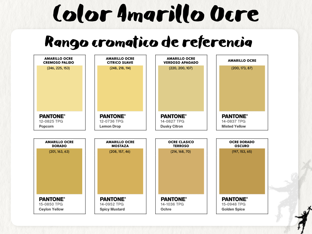
Yellow Ochre isn’t just a single color—it’s a tonal family. Most of these paints are made from either PY42 (synthetic) or PY43 (natural), and their exact hue depends greatly on the source and processing of the pigment.
So, rather than declaring one brand “better,” this comparison reveals a spectrum of creative possibilities. Choose your Yellow Ochre based on the effect you want—not just the label.
Watch the Full Video
🟨 Full Video (YouTube)
👉 Which is the Best Yellow Ochre? Full Comparison
🟨 Short Trailer
👉 Watch the 1-minute preview
Visual Resources: Images and Tables


If you’re passionate about watercolor and want to better understand your materials, subscribe to my YouTube channel and follow these comparison videos.
More colors, pigments, and deep-dive analysis coming soon!

Deja un comentario