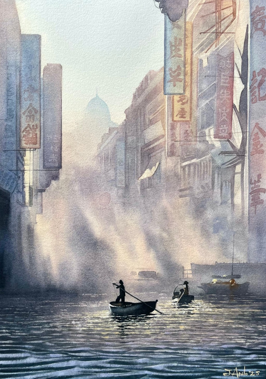
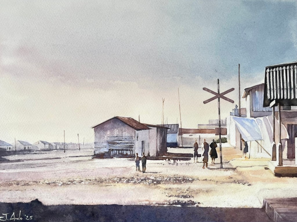
Morning Boats and Mist in the Heart of Hong Kong
This was one of those paintings I hadn’t planned at all. I simply stumbled upon an old black-and-white photo of 1950s Hong Kong—and immediately fell in love with it. The atmosphere, the blend of urban density and marine tradition, the hazy light of early morning (or perhaps late afternoon)… everything about the image drew me in.
From the layered facades and shop signs to the gentle silhouettes of the fishermen, it all matched perfectly with the artistic thread I’ve been developing lately: capturing scenes of everyday life in cities and towns from decades past. This costumbrista moment—boats gliding through the foggy water in the heart of a bustling Asian city—was irresistible.
About the Painting Process
The biggest challenge was, as you might imagine, choosing the right color palette to evoke that delicate atmosphere, starting from a monochrome reference.
After several studies, I settled on a palette centered around muted violets and pinks, greyed down to maintain subtlety, and balanced with soft golden yellows in the upper portions of the painting. The idea was to suggest a gentle backlight—not too strong—while harmonizing warm and cool tones.
A curious and unexpected detail: this was the first time I used Roman Szmal Aquarius watercolors. Some of their pigments behaved quite differently—when mixed on the palette and later applied with generous water (especially in the “wet on wet” areas like the mist), the pigments began to separate. In some zones I observed carmine pulling to one side, while cool bluish-greens floated to another. It was unexpected… but beautiful. As I like to say, if it happened, it was meant to happen.
In the end, I’m very happy with the result.
Materials and Technical Details
📐 Size: 36 × 48 cm
🔲 Format: Portrait
📄 Paper: Hahnemühle, 600g, cold press (fine grain)
🎨 Watercolors: Roman Szmal Aquarius
🎨 Palette:
Yellow Benzimidazolone (PY154)
Red Cherry Quinacridone (PR209)
Violet Dioxazine (PV37)
Misty Morning (PG50/PV19)
Blue Cobalt (PB28)
Indigo (PB60/PBk7)
Sepia (PBk7/PBk9)
📅 Date: March 2025
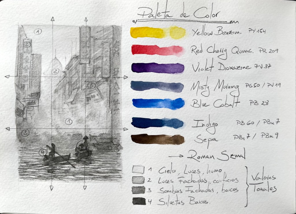
Sketch and Color Study
Here’s the value sketch and custom palette I used to define the balance of tones and pigments. Key observations during the process:
- Tonal breakdown of light, façades, shadows and silhouettes
- Placement of the atmospheric haze as a compositional tool
- Color decisions made to balance soft hues and suggest depth
📷 Preliminary sketch and color swatches below:
Final Thoughts
This painting came to life unexpectedly, like a scene waiting to be remembered. It was a joy to explore the meeting point between architecture, water, atmosphere, and tradition—each element blending into the next through light and pigment.
If I’ve managed to make the viewer feel the mist in their lungs or the quiet rhythm of a paddle through the morning water, then I’ve accomplished what I set out to do.
You can explore the rest of my watercolor collection by clicking the link below.

Deja un comentario